

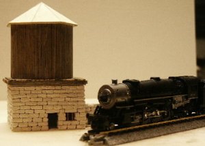
water tower scratchbuild
- Thread starter belg
- Start date
You are using an out of date browser. It may not display this or other websites correctly.
You should upgrade or use an alternative browser.
You should upgrade or use an alternative browser.
Neat water tank!
to post several images you need to place them on another web site, then use the IMG button to add the url (web address) where you want it withing the post.
If you go to the live chat link at the top of the page, you can read the instructions for posting images in chat. Not the same, but a similar concept.
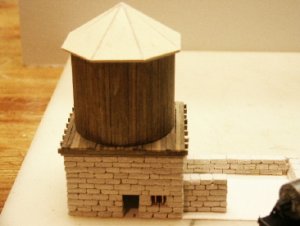
The blocks are made from plaster first I poured an 1/8" thick layer and then scored and snapped 1/4" strips then cut and fit like bricks. A very tedious process.
Have you tried a product called Sculptamold? It's a clay like product that dries in the oven. I've used it for rock work and it's quite good. You can do all your carving while it's soft. It dosn't shrink and it's available in colors. If you get a wall you really like, make a mold and reproduce it in plaster.
Originally posted by belg
A very tedious process.
No doubt!! In N scale yet!!
 The blocks look fantastic..as does the wood siding and the conical roof! :thumb:
Well the tedious aspect has paid-off big time as the realism is fantastic. The cold joint between each stone combined with the shadows makes the effect very believable.
Originally posted by belg
The blocks are made from plaster first I poured an 1/8" thick layer and then scored and snapped 1/4" strips then cut and fit like bricks. A very tedious process.
That is supurb work, especially the stone walls.
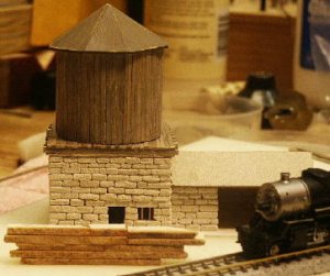
I'm thinking that something like that would look great on a layout with no roof, doors or windows. There are lots of abandon buildings like that around here where all the wood is gone and only the walls just like yours are still standing.
Don
I'm thinking that something like that would look great on a layout with no roof, doors or windows. There are lots of abandon buildings like that around here where all the wood is gone and only the walls just like yours are still standing.
Don
That is REALLY nice work, Belg! Tedious, yes...but nothing compares to individually stacked stones. Well worth your time, it looks. :thumb: :thumb: :thumb:
Here is a water tower that I made. I needed several, so I made a mold to allow me to make them quickly out of resin.

height
If it is too high or too low, you can always redo the landscape onto whic this fits...set in on a slight hill, or into a light slump...Eitherway, beautiful.
If it is too high or too low, you can always redo the landscape onto whic this fits...set in on a slight hill, or into a light slump...Eitherway, beautiful.
update
Here's a new photo of the watertower. I put together a sample of some scraps to get the color for the stonework as I do not want to go onto the real thing til I'm happy with the color, which at this point I'm not. There is not enough variation in the tones and I'm thinking a grey contrast would be better. Any opinions?
Here's a new photo of the watertower. I put together a sample of some scraps to get the color for the stonework as I do not want to go onto the real thing til I'm happy with the color, which at this point I'm not. There is not enough variation in the tones and I'm thinking a grey contrast would be better. Any opinions?
") :thumb:
:thumb: