Evolution of my MRR's logo...

jbaakko

Active Member
Jun 25, 2006
1,082
0
36
39
San Diego, CA
rr.blockchoice.com
Here's the evolution of my model railroad's new logo (and name).

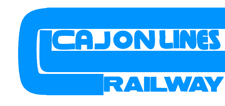
I've gone with Cajon Lines Railway, as I'm modeling the Rail Lines on Cajon pass.

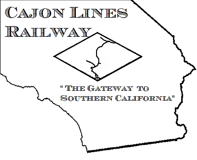
V1, Brand new design. Small slogan, Does not work well for scaling (smaller).
clr_logo_400.gif


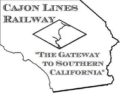
V2, made the slogan larger.
clr_logo_400_new.gif


This is the current, V3 logo, much better for scaling.
clr_logo_400_new1.gif
 

CSXect

Member
Dec 31, 2007
515
0
16
Cool

I made up some fantasy/freelance rr names they are BFT(Buckeye freight and terminal ) Kentucky Coal & Container Corp. and Michigan Saginaw Union Leasing(MSUX)

Also have one for a narrow gauge but its name may be offensive to some. The Logo would have been a large rooster next to a big rocksign1
 

Ralph

Remember...it's for fun!
Jun 18, 2002
5,134
0
36
64
St. Paul, MN
Visit site
Hi Josh,

Neat to see the evolution. I'm assuming the dark bold letters work best in small size. Would you be willing to briefly describe the "scaling' process for us?

Ralph
 

jbaakko

Active Member
Jun 25, 2006
1,082
0
36
39
San Diego, CA
rr.blockchoice.com
Well the initial logo is 800px wide. When I re-size it to 400 & 200 for other uses, the letters for V1 & V2 get blurry due to the stripes.

Operators Manual...
So, in conjunction with the logo and name, I've developed an initial operators manual. This preliminary print applies to my future layout, not the current switching layout.

I need some feedback. Is there any info you'd like to know, that I have not stated, or something I should better elaborate on?
http://modelrailroadtips.com/index.php?module=Downloads;sa=dlview;id=32
 

Ralph

Remember...it's for fun!
Jun 18, 2002
5,134
0
36
64
St. Paul, MN
Visit site
Thanks Josh, I was just looking for general information for the membership such as a good starting size, font size etc. that will reduce well for scale logos.

Ralph