What's a good color.....

Jun 18, 2004
487
0
16
56
barboursville, wv
hello everyone, can someone tell me what a good color for benchwork is? i have seen different colors, but i dont know what color would be best for this. i dont want it to stick out, but at the same time i want it to look professional. any ideas are appreciated. thanks!:wave:
 
Oh man. This is SO open to interpretation.

I guess it's what kind of image you're trying to convey. Most straight benchwork I've seen is painted black or dark brown to reduce it's impact on any nearby scenery. Some have gone so far as to cover it entirely with black felt, or some other non-descript cloth.

I've already figured my layout will be "encased" to keep the felines off it, so I'm going toward a red-oak or walnut stained "cabinet" around the layout, with plexiglas or glass panes between the lower portion and the ceiling. This should give it a nice museum feel.

So...what do you like? Black, brown, grey, etc, or stained wood?
How about floor to ceiling scenery such as John Allen would do?


Michael
 
hey Dragon, thanks for the input. i kinda thought i might go with a lighter grey, kinda like a light industrial grey. im not sure how it would look, but i guess i could try it. i also have a gallon of darker earth tone color, but im not sure how it would look either. you have any opinions about either of these colors?

:confused:
 
Any dark earth tone color will do, but the trick is to get one that will complement the scenery. If there's mostly industrial or city scenes, then a black or dark grey works; if it's forested mountains, green is good. You can always try painting a small section to see what it looks like. And use satin or semi-gloss paint, because you want to be able to clean it easy, but if it's too glossy it detracts from the layout.
 
It is interresting to note that Jack models the Y.V.RR in summer when the hilsides are typically covered with dry grass in that distinctive yellow color. The light color selected for the benchwork seems to disappear into the grassy scenery. If you are modeling an East Coast road where the grass would be very green, you would want a color that would complement and blend in with your primary color.
 
thanks guys for all the comments and suggestions, they really help. i really like the color in the pictures of the YSVR, it really has a nice tone to it. i think that color would look good on my layout, im modeling fall time on the east coast. anyone know what the name of that color might be? thanks!
 
When I had a layout in an apartment with wood floors, I stained the benchwork the color of the floor so it blended in like a piece of furniture. Now, in the basement, modeling the NYC I had some paint mixed to match NYC dark grey, it's all on what you want. The YV RR does look neat and clean, though, and blends is well.
 
There have been some articles on this subject in MR magazine and they looked at some popular layouts like Rick Rideouts and David Barrows.

Basically midwest layouts seem to look best with an upper fascia of forest green and lower fascia of black. Western layouts tend to look best with an upper fascia of olive green or tan/buff and lower fascia of black. The idea is the fascia's shouldn't draw attention to themselves but rather compliment the layout and cause your vision to be drawn to the RR scene. Make sense?
 
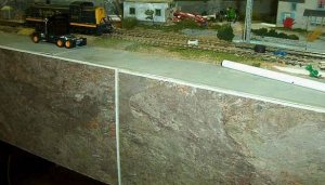
I use rock colored floor tile from Lowes. It has a nice finished look and blends in with the cut out of the earth layout effect. Fred
 

Attachments

  • tileit.jpg
    tileit.jpg
    46.7 KB · Views: 94
CharlesH. said:
What would you recommend for a southwest Canada layout during fall?
Many of these successful fascia's have been arrived at thru experimentation. I'd suggest looking at lots of layouts in MR magazine etc and keep an eye on those with fall scenes. Maybe you'll see something which looks like it will work well.
 
trainsteve2435 said:
thanks guys for all the comments and suggestions, they really help. i really like the color in the pictures of the YSVR, it really has a nice tone to it. i think that color would look good on my layout, im modeling fall time on the east coast. anyone know what the name of that color might be? thanks!

If I remember correctly, the East Coast has a lot of dark, loamy, soil, and at least in the Northeast where there are rocks, they are moss covered shale in dark greys. I think I would use a dark charcoal grey color to make the benchwork blend with the ground colors and offer a strong contrast to the bright fall colors.
 
hey guys, i really appreciate all the suggestions and ideas, and dash10, thats really a cool idea, it looks great too. i think i will go with a sorta charcol grey like Russ Bellinis suggested. i think it would look appropiate for the era, and local im modeling. thanks again for all the great suggestions.:thumb: