

Logo Opinion Poll
- Thread starter Cannonball
- Start date
You are using an out of date browser. It may not display this or other websites correctly.
You should upgrade or use an alternative browser.
You should upgrade or use an alternative browser.
I wanna know who turned you onto paintshop in the first place:curse: sign1 sign1
Actually the one with the red is an eyecatcher:thumb: .
Rick
Actually the one with the red is an eyecatcher:thumb: .
Rick
I think they lack the basic element of design, I think you should go and study some more traditional railroad hearlds, and start sketching out a design. It'll almost always come out better on paper than in in "paint". ")
The two main things that detract are:
-You're too dependant on the letters, it makes for an uninteresting logo, your eye is not drawn to it in anyway, except when it's anamated
-Your use of red and black hurts the eye, it's too bold, and in the realworld, woulf fade to a horrid pink and grey in less than a year of sunlight.
I see this as a distant cry of the NYC logo, and take a look at what makes it distinctive... The font is unique (not computer made, but HANDDRAWN.) and also how the letters blend and form the oval, the lines around it just solidify the design.
Also, hearlds (logos) usually do not need to have the ENTIRE railroad's name on it. A good example would be "Santa Fe's" Circle-cross logo. It doesn't say "atchinson, topeka, and Santa fe" does it? It's just enough to be under stood, yet it's not an acronym (reporting mark) That's why I'm not a big fan of CSX's lettering, it relies solely on the letters w/o even a hint of what CSX really means.
Give this some thought.")
The two main things that detract are:
-You're too dependant on the letters, it makes for an uninteresting logo, your eye is not drawn to it in anyway, except when it's anamated
-Your use of red and black hurts the eye, it's too bold, and in the realworld, woulf fade to a horrid pink and grey in less than a year of sunlight.
I see this as a distant cry of the NYC logo, and take a look at what makes it distinctive... The font is unique (not computer made, but HANDDRAWN.) and also how the letters blend and form the oval, the lines around it just solidify the design.
Also, hearlds (logos) usually do not need to have the ENTIRE railroad's name on it. A good example would be "Santa Fe's" Circle-cross logo. It doesn't say "atchinson, topeka, and Santa fe" does it? It's just enough to be under stood, yet it's not an acronym (reporting mark) That's why I'm not a big fan of CSX's lettering, it relies solely on the letters w/o even a hint of what CSX really means.
Give this some thought.
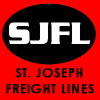
Also, St. Joeseph is Railroady, "Frieght Lines" sounds like the arch rival, A TRUCKING COMPANY! :curse: How about like "St. Joesph & Other town" or "St. Joesph (N, S, E, W, ect.)" or St. Joesph (Terminal, Connecting, Railroad/way, or Central)
Wow that water out in California must be brutal. I say keep the name it is orginal and unique and you own it. Yeah the logo needs a little work but as a fan of the PRR I can state 100% letters can make a very interesting logo and PRR is probably the most known in the world.
The PRR's logo is an EXCELLENT design, in the fact that all the PRR letters are beautifully woven together to make a visually appealing design, and furthermore the choice of colors is excellent, and weathers VERY well, and finally, the whole design is reinforced with the keystone, so you KNOW it's Pennslyvania: The Keystone State! :thumb:
Too late to change it now. I already bought the domain name.MilesWestern said:Also, St. Joeseph is Railroady, "Frieght Lines" sounds like the arch rival, A TRUCKING COMPANY! :curse: How about like "St. Joesph & Other town" or "St. Joesph (N, S, E, W, ect.)" or St. Joesph (Terminal, Connecting, Railroad/way, or Central)
At least no one can accuse you guys of anything less than brutal honnesty.
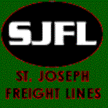
Green and black is ok, but you need a CONTRAST color to those colors, a good golden yellow would do nicely.
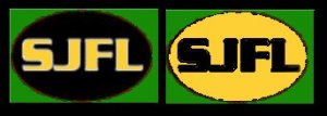
I say keep the logo as you have it on your avatar, and model your layout as a intermodel
system!
David
system!
David


Cannonball said:Well.... Looks like the corporate big dogs got me.
What ya' gonna do?
Oh no! Now all of your rail-passes are no longer any good! Speaking of which, why are you even bothering changing the color to BNSF? I'm modeling a CNW thing in modern times and you don't see me switching, no?
Why am I bothering?CNWman said:Oh no! Now all of your rail-passes are no longer any good! Speaking of which, why are you even bothering changing the color to BNSF? I'm modeling a CNW thing in modern times and you don't see me switching, no?
Why not?