I Say "Yes yes and Yes!"

Well...
I'll Try to "explain" what you see, it's not an apologize, but and explanation:
(some things have a really idiot one, you'll see)
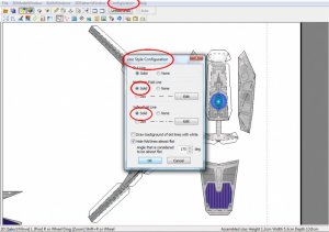
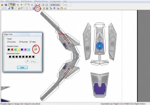
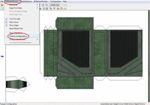
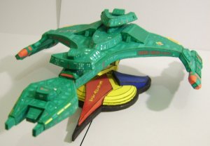
Lines: don´t make the lines with ...... and with -----!!! take the solid lines for the flaps and for hard edges and erase the rest!
Well.... As it was my first one, I have left the lines as a guidance for the "newcomers" for the hobby... I started at papermodelling asssembling the Homeworld Hammerhead Corvette, from Erick's models, if that had no lines I would be trying to assemble it till present day. But I admit, the "Lined" version is quite ugly. I must confess, I'd never intended to make a no-line version but.... now that you mentioned, I managed to find the menu to do this in pepakura!
(lol)
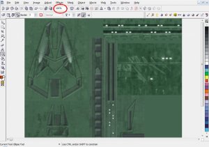
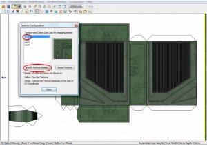
texture: you can´t anything for the texture, but it is bad!
That's one point I really need some advice. What is a good texture? Why there's nothing I can do about?
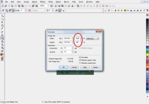
I am asking because I work everyday in Photoshop, and I'm used to set my images to 300 dpi resolution, CMYK scale, BUT, In the hurry to make this (it was made in less than 3 hours, first version--this is the second-- to show my wife how cool pepakura is) I used the textures from the game folder (ok, I'm stupid in doing this) but, if there something that can be done to make these textures better (or make some new textures), I'll surely redouble my efforts in discovering and doing it.
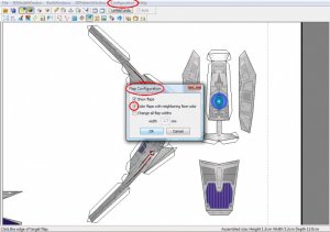
size: SMALL! may be 1:2000? I see no scale!
When I was making this, I tryied to search some data about the ship, to adjust it to te proper scale. Based in the data found in some wiki, this ship is supposed to be at 1:1000 scale. I say supposed just because no matter how much Gomide's tryied to explain that to me, I must confess that I cannot understand very well about how scalate the model in pepakura.
Note that I've never mentioned nothing about Metasequoia, I just used it to convert the .ms3d / .shp (Milkshape or the game format?) format to something like 3ds or lwo (i really can't remember, sorry). The fact is, there was NO editing. Okay, you can throw you shos on me now, I swear i won't scream
but the worst are the flaps!!! look the hull parts!!! they are not alike! maybe you know what I mean!?
Now that you're talking... damn...
sign1
Lemme see if I got the point:
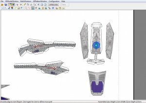
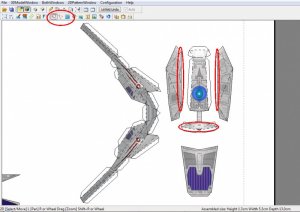
- point 1: Red rectangle, upper right, upper front hull (just behind the saucer):
Nice flaps (already no-lines, noticed?), nice fit. Maybe just a little too big for the model.
- point 2: Red rectangle, upper left, Impulse engines:
I admit. the flaps are announce1 HUMONGOUS!!!!!!! When I started designing this, just looking at the game, I'd never noticed that those creeps had some volume. mea culpa, mea maxima culpa
- point 3, lower left, lower hull:
okay, tha fla #8.147 attaches to the hull at the opposite point of the flap number..... wait! what opposite flap?!?!
- point 4, just near left point three:
Damn! the flap juxtaposed the other flap!
But there's more, for example: in the lower saucer section, that "sub-bridge" has a crossy thing (img) that is a sort of curved section of the hull, as in tha Martin Sanger's Constellation, e.g. Thete is some way I can make this part dettached from the hull, with some volume, making some justice to the "real" ship?
"Metasequoia" I presume you'll say.
I have no intention of making nice, incredible models as a big part of you in the first moment (of course), but at the same time i hae no intention of giving up, so... thanks for the coments (and your sincerity, I would never expect less from any of you) an be prepared, because I'll still buging you with doubts, tests, betas and more and more things...
=)
Regards
Stack


") !
!


")