Help to locate a font

Ron Caudillo

Creative Advisory Consultant
Staff member
Moderator
Feb 8, 2004
389
313
58
Davenport, Iowa
Hi all,
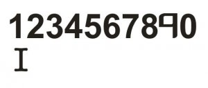
I need a font that is simple and easy to know EXACTLY what the character is regardless of rotation. Since I will be using the characters mostly by themselves, there needs to be definite difference between a capital "I" and the number "1" and the number six and the number nine.

The font should be bold enough to see all of the lines and curves that make up the character but have enough white space to distinguish the character if it is reduced in size, such as 6 or even 4 point.

Here is an example of what I'm trying to achieve, but I had to use three different fonts. The "9" is a bit wonky, but I hope you get the idea. Thanks for any help, oh yeah, if it's a free font, all the better! Font.jpg
 

Revell-Fan

Co-Administrator
Staff member
Administrator
Moderator
Aug 1, 2009
11,595
12,338
228
Vreden
I use FontViewOK to find out how my fonts look like:

http://www.softwareok.de

I have checked my installed fonts and found a few which might fit the bill:

A028 Extrabold
Aharoni
Aldhabi
Comic Sans
Courier New
Franklin Gothic Book
Georgia
OCR A Extended
OCR-A BT
OCR-B 10 BT
Verdana

Just take a look at your system, maybe you have some of them. :)
 

spaceagent-9

Right Hand Man and Confidant
Moderator
Jul 10, 2013
3,104
3,473
143
62
pheonix
not an easy task!! I suggest that you modify the 6 and I after you lay it in, shortening or slanting it , so that there is no mistaking them. I would imagine that you would only have a few, so it might be worth your time to edit them that way in Paint, and choose a font you really like.
 

Lee Clifton

Wisdom and Kindness, A Zealot Sage
Oct 7, 2015
268
173
40
71
Hi all,
I need a font that is simple and easy to know EXACTLY what the character is regardless of rotation. Since I will be using the characters mostly by themselves, there needs to be definite difference between a capital "I" and the number "1" and the number six and the number nine.

The font should be bold enough to see all of the lines and curves that make up the character but have enough white space to distinguish the character if it is reduced in size, such as 6 or even 4 point.

Here is an example of what I'm trying to achieve, but I had to use three different fonts. The "9" is a bit wonky, but I hope you get the idea. Thanks for any help, oh yeah, if it's a free font, all the better! View attachment 147912

Ron try this site:
https://www.myfonts.com/WhatTheFont/

Its helped me in the past to locate a font from a sample.
 

Ron Caudillo

Creative Advisory Consultant
Staff member
Moderator
Feb 8, 2004
389
313
58
Davenport, Iowa
Thanks to all for excellent suggestions!

I was hoping to find the "perfect font" that would not require anything else with it. Underlining is an option I have seriously considered for the 6 and 9, especially if I find a font that has a distinct difference between a stand-alone "I" and "1".

I used the "What the font" website to help design the cookie box for my daughter, She had business cards printed up that we needed to use the font style on the box design, worked beautifully!

I appreciate the help, it appears to be an ongoing quest just like the "find the perfect glue" or "perfect forming tool, etc." is in our hobby, I'm always on the lookout.

Best Regards,
 
  • Like
Reactions: ASC Mclaren

spaceagent-9

Right Hand Man and Confidant
Moderator
Jul 10, 2013
3,104
3,473
143
62
pheonix
well good luck, i searched for special fonts and had no luck. i still suggest modifying a font you like in paint, after you put it on the model, make a character wider or squat, or thinner, etc... i certainly hope you find what you need.