
Can You Artists Out There Help Me?
- Thread starter Lighthorseman
- Start date
You are using an out of date browser. It may not display this or other websites correctly.
You should upgrade or use an alternative browser.
You should upgrade or use an alternative browser.
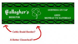
One thing I can think of is - depending on the size of actual size - the thin lines of the cloverleaf might make it hard to see. Also the letters appear to be a light green, maybe using white would provide a better contrast, and the braid also is hard to see since it appears to be a dark green. The braid might be a little too "fancy" in real life, as well.
You should be able to find a useful cloverleaf image on the net somewhere. Try a search for "4H" and remove the "H"'s??
But overall, I like it.
You should be able to find a useful cloverleaf image on the net somewhere. Try a search for "4H" and remove the "H"'s??
But overall, I like it.
Clip Art
Hi Steve,
You can probably find what you are looking for from Micro$oft's clip art downloads. Try searching for "borders" for the braid.
The only drawback is that you will need to use M$ products to manipulate the download.
Let me know how it goes...!
Andrew
Hi Steve,
You can probably find what you are looking for from Micro$oft's clip art downloads. Try searching for "borders" for the braid.
The only drawback is that you will need to use M$ products to manipulate the download.
Let me know how it goes...!
Andrew
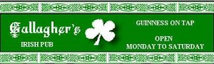
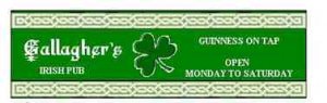
Steve, That's a very nice sign you designed. It should look good on the bar. I know there are probably thousands of different signs you could use but yours should do fine.
Steve, I might be able to help you... Give me the Width and height you need & I'll see what I can do.... ")
Steve.
I agree with Robin. I like the sign just as is. I asked my wife about it and she said it is great. She is Scottish.
Also, that is not a clover leaf it is a Shamrock
I agree with Robin. I like the sign just as is. I asked my wife about it and she said it is great. She is Scottish.
Also, that is not a clover leaf it is a Shamrock
Steve:
I like jmarksbery's sign the best. My idea would be to make the name and the shamrock dominate. Then, add those other details. I made a sign that had a lot of neat slogans, times, etc on it. I felt that the impact of the sign was lost in the detail. You had to stop and read it. If your sign said "Ghallager's" or "Ghallagher's Pub" in big letters, all the other information could be determined while you were in the bar having a cool one!
I like jmarksbery's sign the best. My idea would be to make the name and the shamrock dominate. Then, add those other details. I made a sign that had a lot of neat slogans, times, etc on it. I felt that the impact of the sign was lost in the detail. You had to stop and read it. If your sign said "Ghallager's" or "Ghallagher's Pub" in big letters, all the other information could be determined while you were in the bar having a cool one!
Originally posted by Clerk
...that is not a clover leaf; it is a Shamrock...
DUH!! I CANNOT believe that I called a shamrock a cloverleaf! (Whit wis I daein'???)
JMarksberry...Thanks! I'll give that one a spin. It sure looks better than mine.
Oy, I was thinkin' to meself, I says, "Self, you spent three St. Patty's weekends workin' in a hotel, cleanin' up after the Irish Fire Brigade come down from Philly to spend a weekend at the beach, drinkin' green Guiness and stuffin' corned beef and cabbage down the commode. Now you sees this here sign and you're thinkin', 'Send the fireman to the new pub up the street and let them clean up after them.' ". Nice work guys and a great handle on the Gaelic there, Lighthorseman. When you open up, let me know and I'll send the Irish Fire Brigade your way. Don't worry, I'll send a plunger too.
Thank You!!
N Gauger...Thanks to you, too!
Now I just have to finish up the building for my snappy new signs!
N Gauger...Thanks to you, too!
Now I just have to finish up the building for my snappy new signs!